Dion started painting for Grosh Backdrops and Drapery, under Superior Backings in 1995…
Dion sighs, “I feel really fortunate to have been able to hone my skills and learn on the job here, because I started young.”
What is your first thought when tasked with the job of creating a painted landscape? From where do you draw inspiration – from a combination of images and memories or is the image usually provided for you?
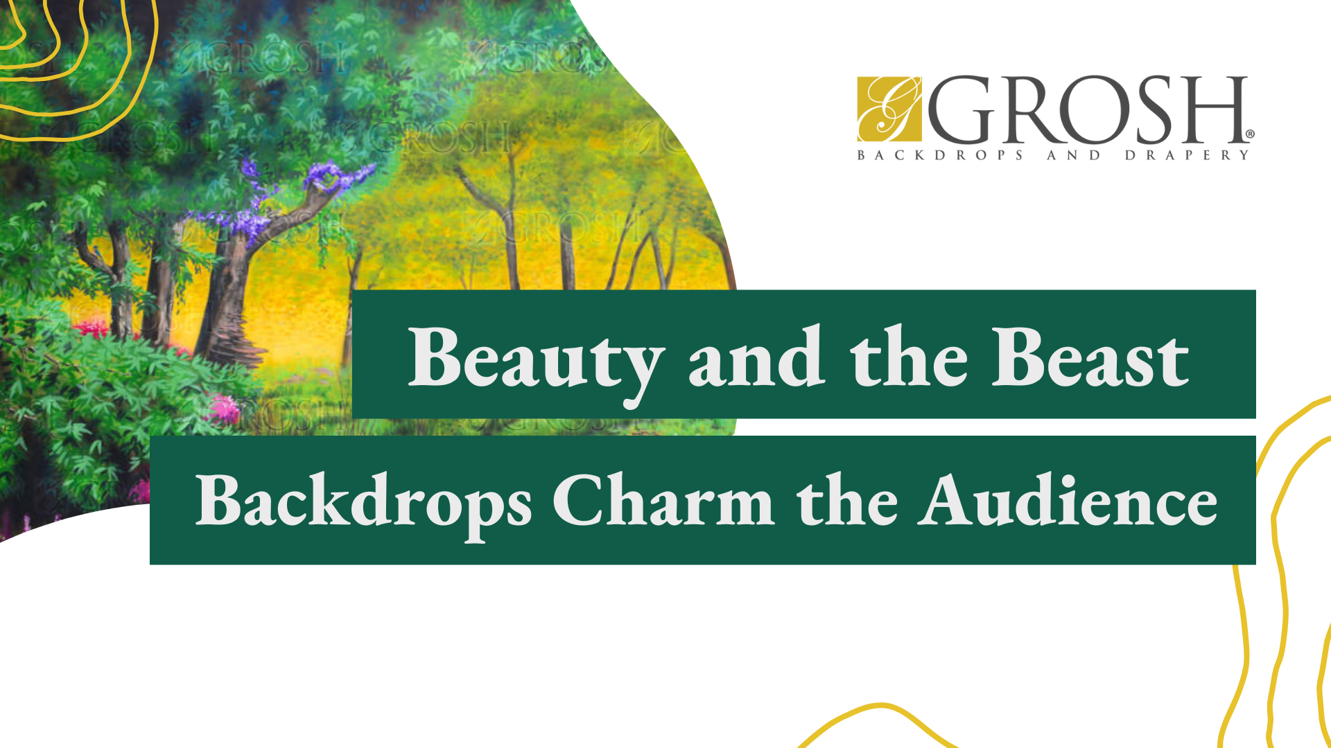
Sometimes a reference is provided or other times I will do some research to find a reference first… maybe a collage of photos… – For “Flower Garden” (S3079), I looked at different images of gardens and pieced them together.
How do you go about transferring your drawing or idea to a 22’H x50’W backdrop? How do you frame or crop the landscape so that it appears to continue on into the distance?
I start with a simple sketch, done in Photoshop and once approved, I grid the sketch by a 1” scale in ratio to the size of the blank canvas. Then I simply transfer the image square by square. The same classical techniques (known as “pictorial art”) that were used during the Renaissance, we still use here.
To create a sense of distance, always, atmospheric perspective is applied – darker, bolder colors in the foreground, and lighter, fainter colors in the background to create a sense of depth.
The sketch is the preliminary step and the finished canvas should really be an improvement from the original drawing, and this happens because we are given a lot of artistic leeway in order to bring the painting to fruition.
Do you decide on color once the image is drawn, or do you already envision the colors you will use, when first drafting the landscape.
Creating a landscape is all about the nuances – in this case, it was all about the flowers. So adding the color is usually the last step and the most fun of the whole process. The reference may dictate what colors are used as well.
How do you create a sense of daytime or evening?
Landscapes are usually best represented during bright daylight. Basically, I start with a blue sky and white clouds… simple. To add a sense of doom, I add a little grey. Usually orange or violet represents sunset or sunrise, but like I said, it’s all about the flowers, for a garden landscape. We want those flowers to pop, irrelevant to the time of day.
How does it feel to create a scene that transports the onlooker into a specific setting? Is there something magical about this creation process?
Creating a large scale scene is pretty labor intensive, but after practicing for so long producing so many drops under short deadlines, you learn how to complete a drop pretty quickly and effectively, by applying the same techniques over and over again.
Yes, I am pretty exhausted at the end of it all, but there is a very satisfying feeling knowing that I created something that was just what the client envisioned; a functional piece of art.


